Green Day 1

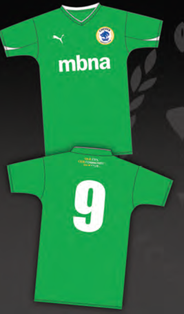
Thanks to Fraser Warburton for providing his memories of the green kit:

When I first starting watching Chester they played in green shirts, old gold trim and white shorts. This sounds very appealing and I was rather pleased as the colours were very unusual, in a period of unimaginative and somewhat plain strips, but it was not a pleasurable experience to see the kit in action.  The green, though by no means the dark ivy green of a hundred years or so ago, was by no means vibrant and was not as light as say Burscough’s kit. Neither did it have the brightening effect of a combination with white which we have seen in recent years with the hoops of  Yeovil and Northwich. The ‘old gold’ is an intriguing description, but was in practice a dark (you could almost say ‘dirty’) yellow, and had the effect of muting the green. It was the official kit for three seasons, from 1959 to 1962.  In the first two seasons it was combined with green and yellow hooped stockings, and in the last with yellow (‘old gold’). 

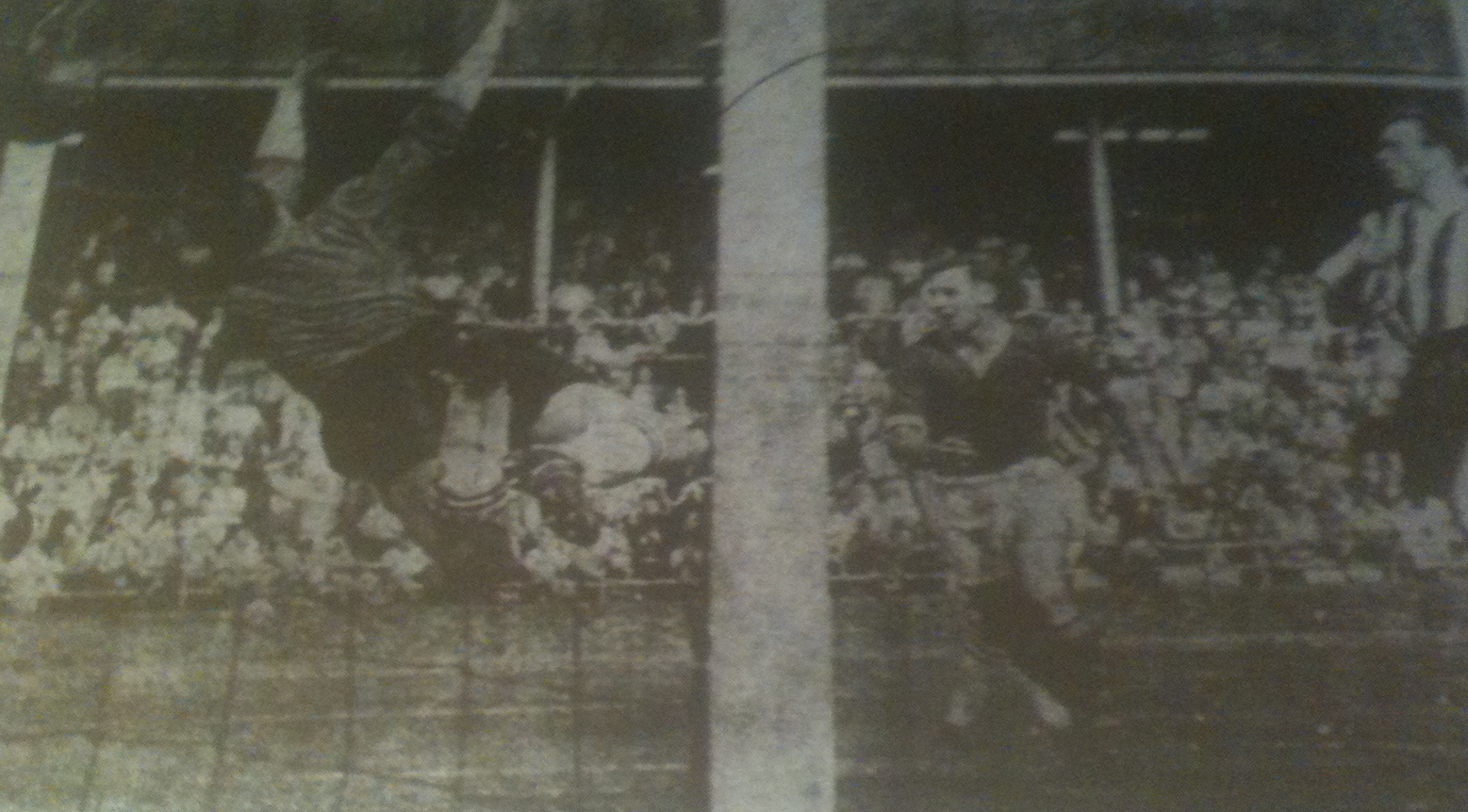
I don’t know whether statistics would prove that the winter of of 1960-1 was unusually wet, but my overriding memories of the time were of watching soaked and drab green shirts on a churned muddy pitch against the background of the weathered concrete and corrugated iron of the old stadium on an overcast day.  What wasn’t actually rusty was painted a dark rust-red colour; even the gravel on the Kop, where the flagged terracing finished, seemed to be crushed from the local sandstone.  Muddy green, brown, rust-red – it was like camouflage.

So where did the green come from?  For obvious reasons green isn’t the most practical colour to play a field-based sport in, and the few teams that use it tend to throw in generous dollops of white.  Was it a memory in the mind of a director of the older green kit?  Information was at a premium in those days, and no-one in my generation was aware that Chester had played in green until 1920.  But that was only forty years before 1959, when the colour was reintroduced.  Nowadays we’re well aware of Chester’s colours in the 1970s; in fact, next season’s kit is a bow to the 1974 strip.  So it could have been a harking back to the past. 

Or was it associated with Stan Pearson as manager?  It was certainly dropped pretty sharply when he left.  He was of course notably associated with Manchester United, and we have become aware in recent years that Newton Heath played in green and yellow.  But this is last recorded in 1896 and in seems unlikely that in those pragmatic and non-nostalgic days that Pearson would have been influenced by this.

It wasn’t very popular.  There was a feeling amongst the older generation that it was something of an aberration from the traditional colours of blue and white stripes, and even the younger supporters, who hadn’t seen the old strip, felt that it was a somewhat unnatural colour.  So the change to the iconic pinstripe in 1962-3 was generally welcomed. If nothing else it was brighter and cleaner.

News travelled slowly in those days.  Teams normally playing in predominantly blue colours still absentmindedly turned up with their change strip, which I remember annoyed me as a youngster.  I was, for instance, looking forward to seeing Hartlepools United playing in their blue and white stripes and was less than impressed when they trotted out in red.  By the time Chester readopted their blue and white in 1962 the penny had dropped that they played in green and we were treated to a succession of teams having to play in Chester’s old green shirts because they had brought only their (by now clashing) first choice colours.  Take a bow again, Hartlepools United.

On a personal level, the colours caused me some embarrassment.  In 1961 someone gave me a programme of a League Cup tie between West Ham United and Plymouth Argyle in which it was stated that Plymouth were the only team in the Football League to play in green. Ever sensitive to any slight to my beloved Chester, I fired off a somewhat snotty letter pointing out the true state of affairs and was a little ashamed to get a nicely conciliatory letter in reply.

Not a kit whose demise should be regretted.  But I’m still fond of it because that was my bonding experience with Chester.

Copyright © 2012 http://www.chesterfootballhistory.com All Rights Reserved

Everything’s Gone Green

I like the look of the new green away shirt and it will not be the first time that the club have played in that colour. At various times throughout their history green has been used as the first choice strip as well as an alternative when colours have clashed.

2012/13 away shirt

After temporarily disbanding in 1899 Chester emerged at their new ground in Whipcord Lane in 1901 and played in various combinations of green and white until 1920 when they switched to black and white stripes. It appears to have been a dark green shirt and team photographs suggest that the club also played in green and white stripes. More recently the club switched to green shirts with gold trim and white shorts from 1959 to 1962 but more of that later.

By the time Chester entered the Football League in 1931 they had already adopted what we now consider the traditional blue and white stripes but initially used green as a change strip. For their first ever Division Three North away fixture, at Wrexham, Chester were forced to switch to green because of a clash with the home side’s blue shirts. Hard to imagine now.

More recently, in an era of some truly awful shirts, City used green and black stripes as an alternative in 1995/96 and green and black checks in 1997/98. The 1995 option was actually described as jade and black and I personally rate it as one of the best away strips the club has used. The less said about the checked shirt the better.

1995/96 away shirt
1997/98 away shirt

When Chester changed from blue and white stripes to green and gold in 1959 it was reported in the Cheshire Observer that the switch was made to avoid changes when colours clashed at away grounds. These days it seems to be the done thing for a club to automatically revert to a different strip for away games but at the end of the 1950s clubs would only change shirts if absolutely necessary. Blue was a popular colour at the time and a number of other clubs appear to have changed in 1959 including Watford (blue to yellow) and Southend (blue to white). With Cardiff City reputedly changing from blue to red next season it’s interesting to note that there were no reported objections when the change was announced at Chester.

In changing to green Chester became one of only two teams to play in that colour alongside Plymouth Argyle. There doesn’t seem to be any explanation as to why green was chosen but it appears to have been chosen for its rarity value rather than as a conscious move to revert to the green used at the start of the twentieth century. There certainly seems to have been no rational reason why gold should be chosen for the collar and cuffs.

The change in colours marked the beginning of Stan Pearson’s first full season in charge. The former Manchester United and England international had taken over as player-manager in March 1959 but the new kit brought little luck and became associated with a particularly bad run in the club’s history. The “continental style” kit had its initial outing in the traditional trial game at Sealand Road when the first team wore it against the reserves and promptly lost 3-1. It made its first appearance in a league game at Notts County where Chester lost 2-1 after Eric Davis had given Pearson’s side a first half lead.

Eric Davis scores the first goal in green at Notts County

Chester managed to narrowly avoid re-election in 1959/60 but the next two campaigns proved disastrous with two bottom of the league finishes. The green kit outlasted Pearson who was sacked after a 1-0 FA Cup defeat to non-league Morecambe at Sealand Road in November 1961. By that time Chester were in the middle of a run of 26 league games without a win and the green shirt was seen by some supporters as one of the factors behind this run.

In December, after a 3-2 home defeat to Aldershot, the Cheshire Observer reported that one gentleman in the boardroom had put the blame on defeat on the green shirts. There certainly seems to have been a general feeling amongst supporters that the colours were associated with bad luck and that the green was not bringing Chester the luck of the Irish. Many fans also expressed their regret that the traditional blue and white stripes had been abandoned as this was still associated with many pre-war achievements.

At the end of March 1962 the club announced they were discarding the green and gold and replacing it with white shirts with narrow blue vertical stripes and the new kit was first used in a friendly against German side Hamborn in April. Chester had briefly flirted with white shirts and black shorts in the weeks leading up to the announcement although ironically they were wearing the green and gold when the long run without a win was ended with a 4-1 victory over Chesterfield.

I’ve never seen a colour photograph of the old green shirt but even in the black and white pictures it comes across as an extremely lacklustre kit. Next season’s away shirt looks a lot more vibrant and it’s impossible to imagine it having the same disastrous effect as the early 1960s version.

Copyright © 2012 http://www.chesterfootballhistory.com All Rights Reserved

Don’t Stand So Close

After posting the last photographs of the old Sealand Road ground I was provided with some more superb photos of the Stadium by Fraser Warburton. There are plenty of photos of the main stand being demolished but it’s rare to see pictures of its construction behind the old wooden stand.

Building work started on the new stand towards the end of the 1978/79 season and Fraser’s three photographs were taken in May 1979 after the final home game against Sheffield Wednesday. In the short term the method of construction proved beneficial as it allowed the ground to remain fully functional but when the wooden stand was demolished it created an awful no-mans land which destroyed the character of the ground. The overall appearance was hardly helped by the chicken wire fence erected parallel to the touchline in front of the stand.

The first photo is one of the best pictures I have seen and was taken from the corner by the open Kop end.  It shows the east wing still in place in front of the new structure.

The second photo is a closer view of the new construction taken at the same time as the first picture.

The next picture is actually taken from the Cheshire Observer and although the quality is not particularly good I thought it was interesting because it was obviously taken after the first two photographs but before the final one. It shows the west wing of the wooden stand (nearest the Sealand Road End) was the first section to be demolished.

Fraser’s final picture shows that demolition had progressed slightly and most of the west wing had been cleared but the metal struts holding up the roof were still in place as was the metal crossbeam following the old roof line. In addition the new stand roof had now been erected.

It’s interesting to see the edge of the central section of the wooden stand which was in place 10 years before the wing extension was built. This marked the end of the original stand which was the only seating available in the 1920s when Chester played in the Cheshire County League. The west wing was the first of the extensions to be built, in 1931, with the east wing added a few months later in time for Chester’s entry into the Football League. The banner photograph for this website shows work being completed on the second wing.

The final picture is taken from the Chester v Walsall League Cup programme, the first game in front of the new stand. It was taken 12 days before the start of the season. By now the old stand had been completely removed but there was still a certain amount of work that needed completing and very few seats were in place.

Once again if anyone has memories of the construction of the new stand I would be interested to hear from them. Even better, I would be fascinated to see any more pictures.

I will be adding more photos of the ground in future blogs but I have a long list of things I want to cover so I’ve no idea when this will happen.

Copyright © 2012 http://www.chesterfootballhistory.com All Rights Reserved

From a Distance

I came across a couple of fascinating photographs of the old Sealand Road ground recently and would like to thank former Manweb employee, Peter Thomas, for allowing me to use them. Peter’s pictures were taken from the top of the old Manweb building which was itself demolished at the turn of the century. I’ve added a couple of my own pictures, taken in 1990, which also show the outside of the ground from a slightly different viewpoint.

The two Manweb pictures show the view looking up Sealand Road towards the city centre. The patch of green on the left of Sealand Road is the Greyhound Stadium with the old football ground just above it. I think that the pictures were taken in the mid 1970s based on the work that appears to be taking place between the two stadiums. I believe that this is the construction of the small industrial estate that was built following the sale of the old training annexe in 1973. It also appears as if the picture was taken before the new office block was built at the front of the ground, around the time of promotion in 1975. You can just make out the old wooden office at the corner of the Main Stand and Sealand Road End. The old wooden main stand was replaced in 1979.

The Greyhound Stadium was itself demolished around 1986 while the football ground was vacated in 1990 and then eventually knocked down in 1992.

The third picture was taken from the inner ring-road in spring 1990 and shows how much the old ground used to stand out on the skyline.

The final picture is taken from Bumpers Lane before the final game against Rotherham United in April 1990.

If anyone else has any further thoughts on the dates of the photos taken from the top of the Manweb building I would be interested to hear any comments.

Copyright © 2012 http://www.chesterfootballhistory.com All Rights Reserved

Observer Posters

After I published the On The Buses article Tommy Jones reminded me about the car stickers produced by the now defunct Cheshire Observer in the mid-1970s. As a follow up I thought it might be an idea to put something together about these posters which even at the time seemed peculiarly dated.  I did write about them in a programme article earlier in the season but I’ve included a couple of additional examples for this piece.

I seem to remember that the very first one was launched during summer 1974 and have a vague memory of the Cheshire Observer asking readers what the phrase “Chester 3-4-5′ meant. At the time there was no indication that the phrase was linked to Chester FC so I don’t think anyone initially had any idea what on earth it was all about. For those still unsure it meant Chester for Division Three 1974/75. It may make vague sense now but it certainly seemed obscure when it was introduced. I haven’t got an example of the Chester 3-4-5 sticker but if anyone else has got one I’ll add it to the piece.

Chester 3-4-5 was quickly followed by Support Chester FC and then Forget The Cup We’re Going Up after the League Cup Semi-Final defeat to Aston Villa Following promotion the Observer went into overdrive and produced the classic “Let Chester Shout With Glee Seals Are In Division Three”. Possibly the last time the word glee was used in any sentence until the recent television programme salvaged the word from obscurity.

Flush with success the Observer then produced two more stickers for the first season in Division Three.

Chairman Reg Rowlands went to town with the stickers following promotion by proudly displaying a selection in the window of his florist’s shop in Bridge Street along with other memorabilia.

Reg Rowlands shop after promotion in 1975

I’d be interested to hear from anyone who knows if any other stickers were produced.

Copyright © 2012 http://www.chesterfootballhistory.com All Rights Reserved